Perfect Alignment in Reflections
These images were taken during the summer of 2017 when I attended the Biennale in Venice on an exhibition in the main pavilion section, “Viva Arte Viva,” of the Biennale. This exhibit – WeltenLinie (One in a Time) – by Alicja Kwade uses powder-coated steel, mirror, stone, bronze, aluminum, wood, and petrified wood. The objects are placed on either side of mirrors so that as the viewer walks past, the actual object is replaced by the reflection of another, perfectly lining up as the viewer moves past to create the illusion of a whole object, except with different materials making up each the reflected and actual objects.
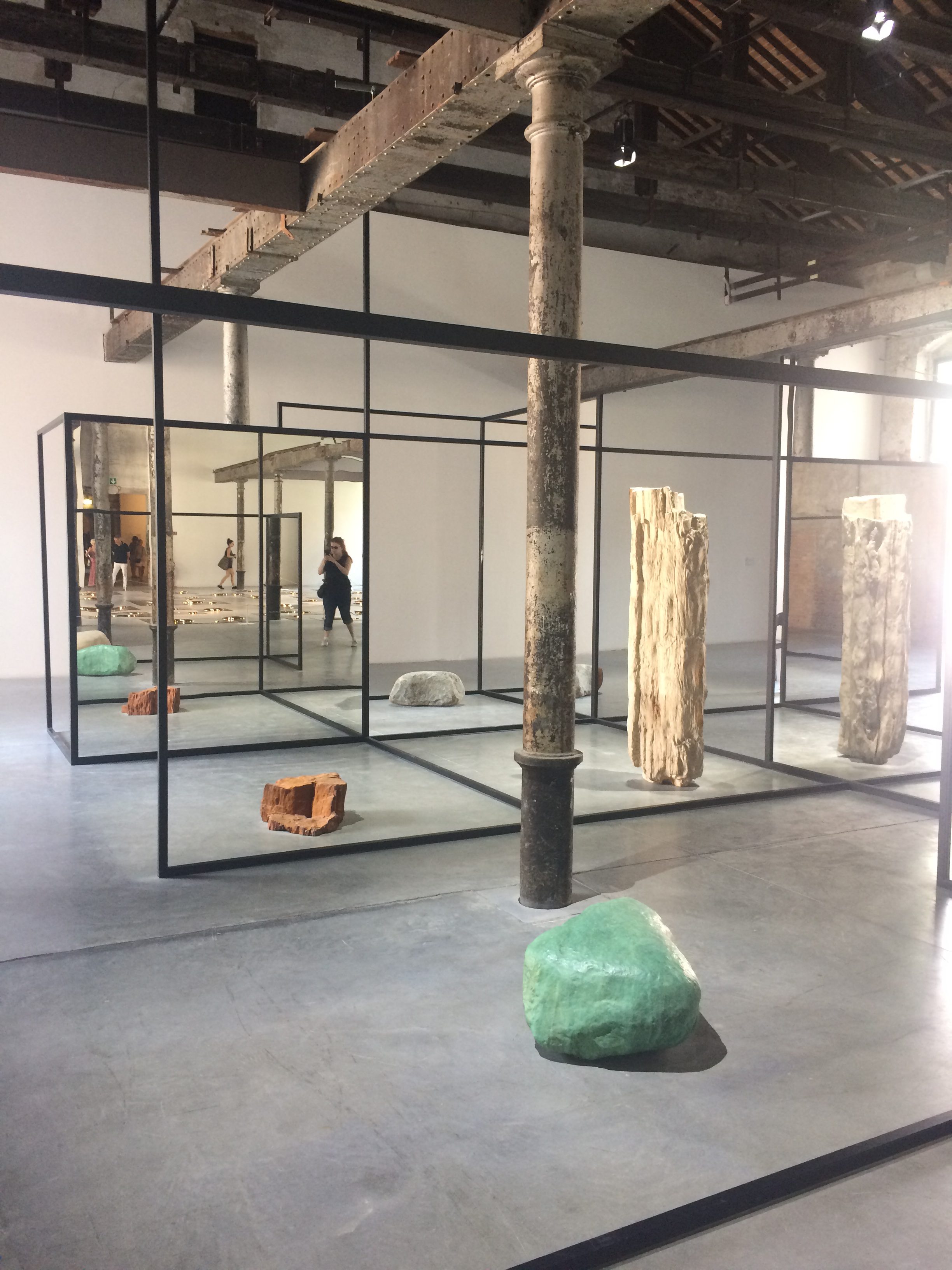
Overview of the exhibit WeltenLinie (One in a Time) – by Alicja Kwade
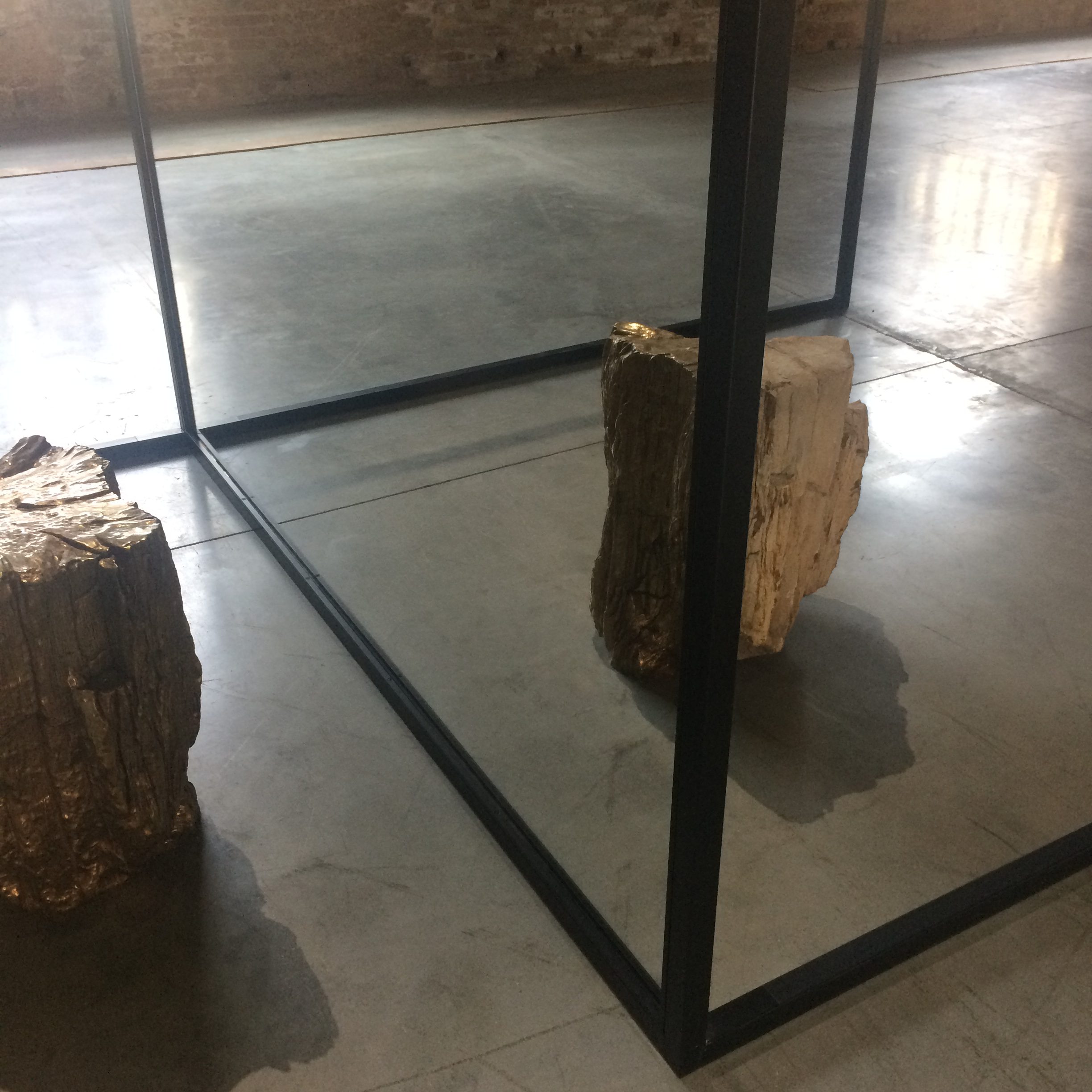
WeltenLinie (One in a Time) – by Alicja Kwade

WeltenLinie (One in a Time) – by Alicja Kwade
Videos of the exhibit WeltenLinie (One in a Time) – by Alicja Kwade
This exhibit relies on symmetry and angles of reflection to create the perfect alignment that leads to one object being replaced by the reflection of another as the viewer walks past. Therefore, as the viewer moves, the angle of reflection and the amount of each object that the viewer is seeing changes. The diagram below shows an example of an angle where the viewer sees approximately half of the “real” object and approximately half of the reflected object. The arrows indicate the viewer’s motion and the resulting change in these angle relationships and what the viewer then sees after this movement. As the viewer moves to the right, he or she sees more of the original object and less of the reflected object. The lighter lines in this diagram generally reflect the result of that movement. Note that this diagram shows a view from above to highlight the angle lines. However, the objects will be viewed from a side view, not from above, in order to be actually reflected. Therefore, there is some error in how these objects are being represented in this diagram.
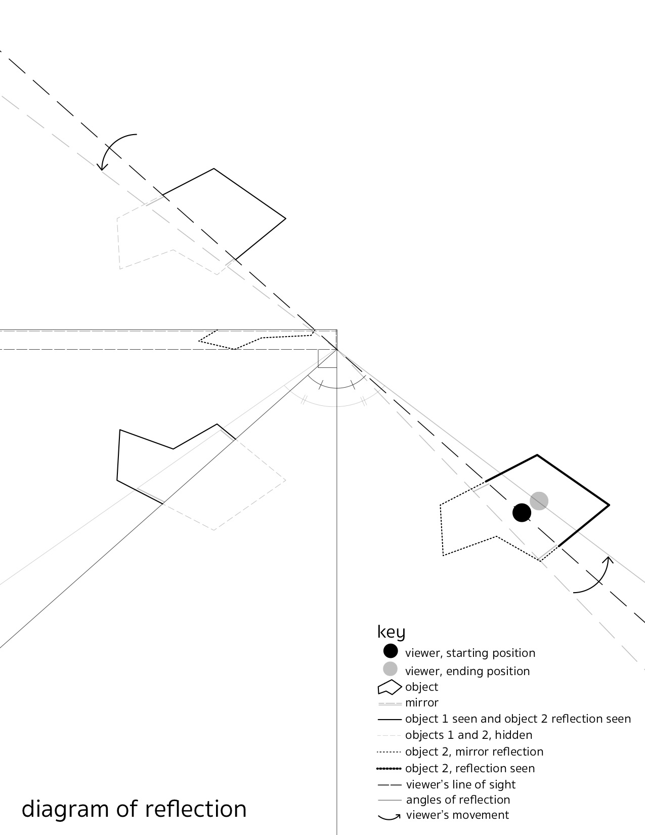
The mathematics behind this exhibit include issues of symmetry and angles of incidence and reflection with the mirror. The angle of incidence is the angle between the perpendicular line intersecting the mirror and the line between the object being reflected and the mirror. The angle of reflection is the angle between the perpendicular line intersecting the mirror and the line between the viewer and the mirror. These two angles are labeled in the above diagram. These angles must be equal because of the physical properties of a mirror and how light is reflected off of mirrored surfaces. Therefore, as the viewer moves to the left, these angles increase (also shown in the above diagram with the lighter lines).
Below is a specific example of how the angles of reflection and incidence line up in this exhibit. The viewer is located at point C and the mirror is line f. Poly1 is the object being seen directly by the viewer. Poly2 is the object being reflected then seen by the viewer. And Poly3 indicates the combination of Poly1 and Poly2 which the viewer is seeing. The viewer is only seeing half of Poly1 – the DGF half – which corresponds to the ONM half of Poly3. The other half of the final object the viewer is seeing is the HKJ half of Poly2, which is being reflected in the mirror. The lines from Poly2 to the mirror indicate the reflection and the angle created between these lines and the perpendicular to the mirror are the angles of incidence. In this case, the angles are 45º. The resulting lines from the mirror (line f) to Poly3 indicate the resulting reflection. These lines along with the perpendicular to the mirror form the angles of reflection, which are also 45º.
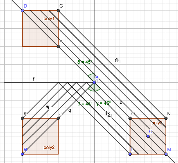
The key to ensuring this alignment and perfect reflection is that the two objects must be perfectly lined up on either side of the mirror. Additionally, the one in front of the mirror (whose reflection will be seen by the viewer) must be a mirror image of the opposing object so that when reflected, the two objects align. This is easier to see in the original diagram above because the objects are not squares (as they are in the second diagram).
The mathematics described above enables the playfulness of this exhibition because the alignment of the objects and the mirror nature of them must be perfect in order to trick the viewer into seeing a single object created by a reflection and an actual object. In this sense, the math enriches the exhibit because, while it is not overt to the viewer (the angles aren’t labeled, the physics involved isn’t described in the exhibit, etc.), it is by necessity present in the exhibit due to the nature of mirrors, light reflection, and the creation of pairs of objects that are mirror images of each other.
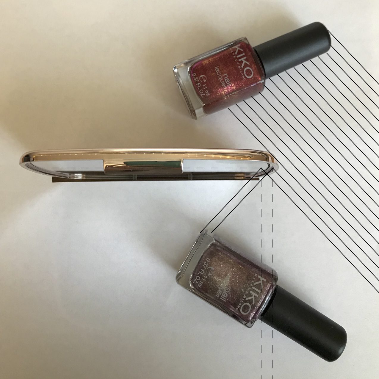
This exhibit made me wonder what would be needed to recreate this effect. Additionally, I wanted to try having lettering on the objects. I did a simple recreation the setup using a makeup mirror and two identical bottles of nail polish containing different colors of nail polish to distinguish them from each other in the final image. The image below shows this setup, with lines showing the reflection of the purple bottle and the direct viewing of the red bottle by a viewer to the right. The dotted lines represent the mirror and the perpendicular lines to the mirror line, showing the equality between the angle of incidence and the angle of reflection.
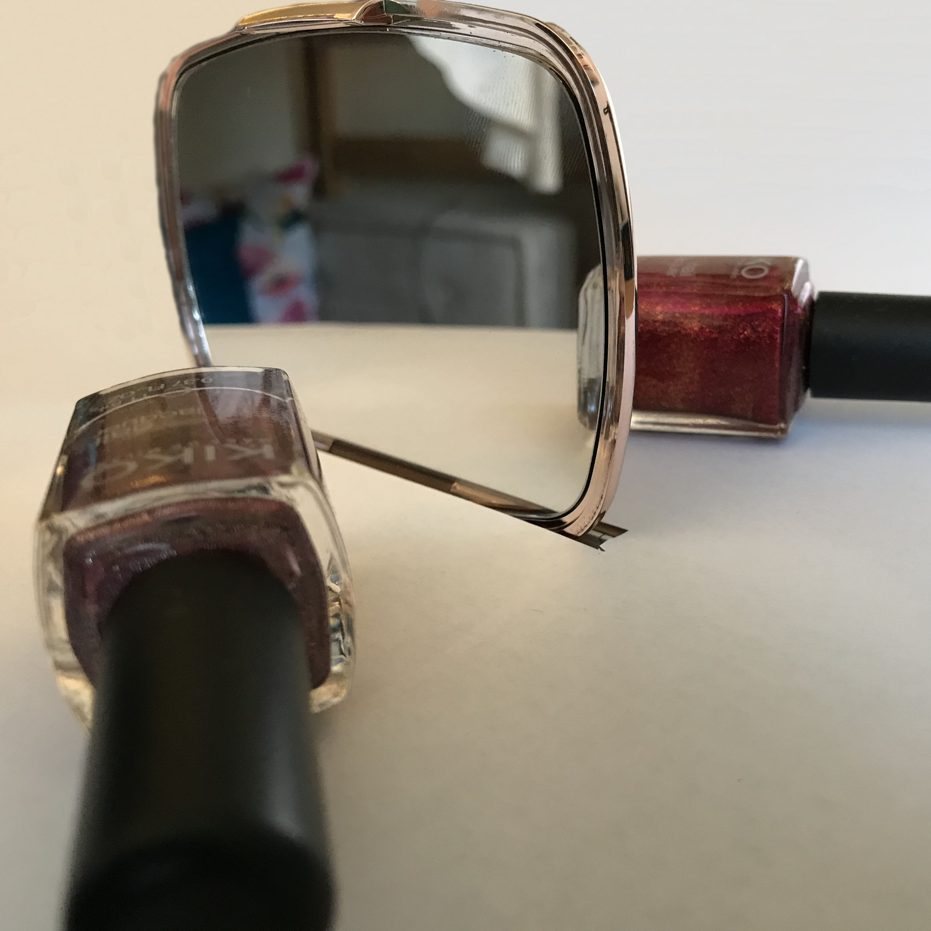
The image below shows this reflection from the viewer’s perspective. As you can see, only the end of the purple bottle is visible, with the majority of the red bottle being seen directly by the viewer.
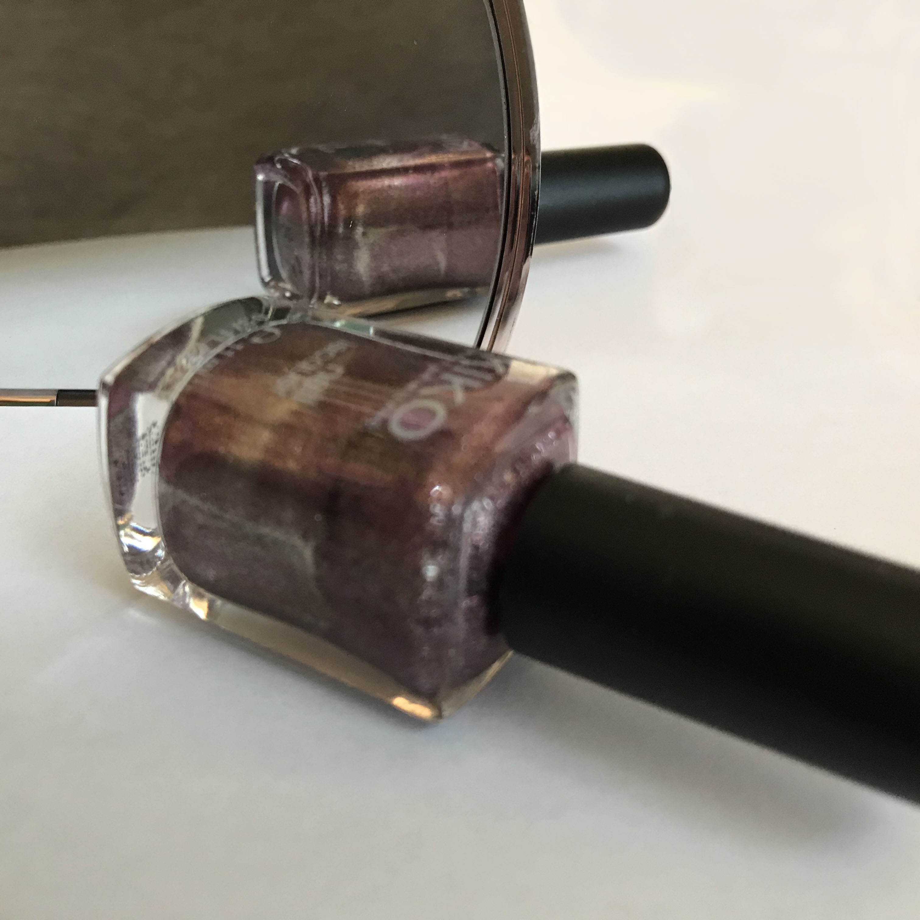
As the location of the viewer changes, the ratio of the amount of purple versus red bottle changes. As seen below, the viewer is now further to the left and more of the purple bottle is visible through the reflection.
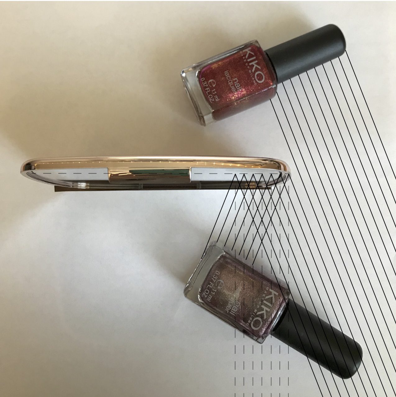
The image below tries to demonstrate this change in perspective. The angle is not quite the same as the above image but there is a noticeable difference between the first instance of the aerial view and this one. The angle of reflection and incidence has changed with the changed location of the viewer (who has moved to the left).
Finally, lettering on the object being reflected would have to be printed in the mirror image, so that when it is reflected, it is legible and lines up with the object being seen directly. In experiments with the nail polish bottles, the lettering did not line up between the reflected object and the direct object. The mirror flipped the letters. Therefore, in order for this to be perfect, the lettering on the bottle being seen in the mirror reflection would have to be printed as the mirror image of the original lettering. Only then would the bottles and lettering line up between the reflected and direct objects. Ultimately, it was relatively easy to recreate a simple setup of the original exhibit by Alicja Kwade. The beauty of the exhibit comes from the forms chosen and the clean setup of the objects and mirrors. When first seeing the exhibit, it is not obvious to the viewer that the reflection trick will occur as he or she walks around the exhibit. This is discovered as the viewer explores, drawing the viewer’s attention to the objects, reflections, and, indirectly, to the mathematics behind this alignment.
For more information on this exhibit and the Biennale, visit:
http://www.303gallery.com/public-exhibitions/alicja-kwade-viva-arte-viva?view=slider

